Bloggers Club 500
A society of top crypto bloggers
UX, UI | Aug 2016

Introduction To The Case
My client for this one was a cryptocurrency based business conglamorate. The idea for Bloggers Club 500 was to have a community of committed and professional bloggers that spread the word out to the world about cryptocurrencies.
The bloggers have two reasons to join the club - community and profit. Since the crypto scene is quite small (strangely), it is beneficial for the bloggers to know each other and see how they can collaborate. The bloggers also have various possibilities for making cash with their activities on Bloggers Club 500 - ads, promoted Tweets and Facebook posts, purchase refference comissions and more.
The whole club is quite exclusive - it is not easy to get into. All bloggers have to be personally invited by a blogger already in the club, they then need to be verified by the admin to join the club. Break the rules in any way and you are out.
I did both the logo and the web interface for this project, so I will show everything about the logo first and then explain some parts of the website design.
NOTE: If you have no idea what a crypto is, here is a video explaining what cryptocurrencies and bitcoins are.
Digital Identity
THE LOGO
As the first thing, we decided to do the logo. I wanted to combine the exclusivity of the club with something symbolyzing the bloggers. After some brainstorming and a couple of itterations on sketches, this is what I ended up with.
It is a simple idea - I combined the tip of an ink pen with the shape of a gem. In combination the message is something like this - these writers are precious. Easy does it :)
COLOR SCHEME
To give a bit of character to the project, we needed to add some color as well. Here is the color scheme of Bloggers Club 500.
LOGO VARIATIONS
It is also important to have variations of the logo for use in different situations. Here is the logo in three color variations for different use cases.
Design System
Once the web identity was done, it was time to move on to the website. We had to make Bloggers Club super easy to use and understand. That is off course the goal with most websites, but Bloggers Club 500 was to be used daily as a tool by the bloggers. This is where they would come in to see new opportunities to earn cash with their work and see their progress in terms of earnings.
The structure of the website did not have to be that complicated - we had to explain what the whole idea is and how it works, have a social aspect to it and then give the members a means of going after that cash.
Here are a couple of the main design principles I used.
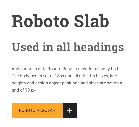
TYPOGRAPHY
The two fonts I used for this project were Roboto Slab and Roboto. I wanted to keep the typography straight forward, but have it all add up. These two variants of the same typeface do just that.
Since I wanted to do big elements, big typography, big everything, I set the base text size at 18px. I selected all other text and linespacing sizes based on that.
The User Interface
USER SIGNUP
Since this website is all about being an easy to use tool and it does not include a lot of functionality I wanted to make all inputs and buttons large so that the experience of using the website would be as pleasant as possible.
This signup form should illustrate how I also wanted to make the page easy to scan for clues on what to do. All I used was strong typography, a bit of accent color and that's it.

HOME PAGE
For the home screen we wanted to have a main area that changes based on what the blogger should do next. In this example the blogger has just created their account and is encouraged to add their blog to their Bloggers Club 500 profile.
Underneath lists of relevant members of the club are available encouraging the exploration of the work done by these bloggers.

HOW IT WORKS
The main purpose of this page is to explain to the bloggers the conditions under which the club works. I mostly worked with the typography, but a couple of simple illustrations and pie charts helped explaining the concept as well.

DASHBOARD - CASHOUT
This is where the bloggers come to claim their rewards - transfer their earnings from the Bloggers Club account to their private crypto wallet.
The navigation of the Dashboard is set vertically on the left hand side with a simple solution for showing the active tab and notifications.

There are a couple of more screens we did for this project, but it would be boring to show you them all, so we just stop here.
If you have any feedback, suggestions or questions - reach out to me.

Feel like reading more?
Want to read about my previous UX design project - check out EY Walk IOS.