Elder Web
Seniors Shopping Service
UX, UI | Feb 2016

NOTE: Elder is a made up name. I changed the name of the project and some of the visuals, but the case and the problem remain very real. I am not allowed to reveal the actual identity of the client that ordered this because I promised :)
Introduction To The Case
Our client owns several stores around the city and for a couple of years now she has also been paying regular visits to the elderly peoples houses in the area doing sales on the spot. This is convenient to the elderly who can avoid the hassle of going to the shopping centers and our client benefits by having extremely loyal customers. The business is good, the customers are happy, but our client is facing a problem. Each time she visits one of the houses she has to load and unload a lot of products. This is normal procedure when doing on-the-spot sales, but the inefficiency is that she sells only a small part of what she normally loads to be sold (you never know what people will want to buy).
So her goal is - reduce the time spent loading and unloading products at the location to free up some time to socialize with the elderly customers. If the clients would order the items that they want upfront the retailer could load up the products that have been ordered, package them by order for easy carrying and take the package to the right person. Much easier, more time for socializing with the customers.
The plan is to place a tablet computer in each of the elder houses so that the people could place their orders up front. Thus project Elder is born.
User Experience Challenges
See if you have ever heard an elderly person you know saying something like this:
Digital devices are scary and confusing, plus without my glasses I can’t see a thing.
or
I do not want to tap on screens, I want to talk to people.
This was generally the reaction when we took a couple of wireframes to one of the elderly peoples homes to see what they think about such an idea.
To me it was not even surprising since the way many digital products are designed nowadays concentrates more on the fresh user interface trends and sleek visuals and less on the principles of usability and accessibility. This project was all about the latest two.
USABILITY AND ACCESSIBILITY
Any user experience designer should design for as large part of the population as possible. This includes but is not limited to people that have limited motor skills, are color blind or are completely blind. When creating user experiences, it is the designers job to avoid making decisions that could limit the usability of the website for a part of the population. These decisions could seem secondary to some, but affect the experience of many others.
Some of the basic user interface accessibility practices are to not use color as the only means of communicating meaning, keeping all text at easily readable sizes and including the HTML alt attributes in image tags so that people that use screen readers could find out what is in the images out on the web.
A quite straight forward idea - everyone should be able to access the public content on the internet. The complications arise when the design or the programming is done without a proper understanding on what is it that limits that access.
Even though most digital designers have enough knowledge about accessibility to build most digital products, the case of Elder was different. The aim was not to include the people with limited motor and vision capabilities, it was all about designing explicitly for them.
DESIGNING FOR THE ELDERLY
To do this right, I did some research before doing any product planning at all. The best source of information I found was an article on Smashing Magazine conveniently titled Designing For The Elderly: Ways Older People Use Digital Technology Differently.
Here are the main takeaways I got from the article:
- Text size no smaller than 16 px
- Enable text size adjustment
- Maximal contrast for text
- Avoid blue color
- Touch targets no smaller than 60 px
- Clear progress feedback
- Reminders of the goal
- Expect attention to detail and long attention span
The UX
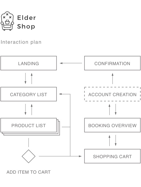
To begin with, let’s scope what processes do we need to both fulfill the business goals and satisfy the needs of our customers.
As is a good practice with products for the elderly, the processes are kept as simple as possible. This is why the process graph below is rather simple.
Once the user logs in using their room number on the Landing page, they are presented with a list of Product categories. Each Product category contains several Items that can be added to the Cart. The Cart can be accessed from both the product category list and the Item list. In the cart the user can remove Items or change the amount. Proceeding with the order brings up a Booking overview. If the user is in the checkout process for the first time, a user form for creating an account is added to the process. The final step is the booking confirmation, from here the user can return to the landing page.
Right, now it was time to try and figure out how to create a set of design principles that include all of the considerations above and put that into practice.
The UI
Since this was the first time for me designing for such a specific audience with such unique needs, I stared out with defining some of the basic design principles.
THE DESIGN PRINCIPLES
Typeface selection
For Elder I selected a typeface that I could use for both the headings and the body text. Montserrat by Julieta Ulanovsky is a geometric sans serif font with a great legibility across all ranges of sizes. It has 8 styles, but for this project I ended up using only one - Montserrat Regular. I did this to minimize confusion or frustration that could be caused by varying typeface styles.

Typeface sizes
For web typography the common practice is to have the body text set at around 16px (defined in CSS in the equivalent of ems or rems). In this case though we wanted to make reading as easy as possible. This is why the body text for Elder is set at a generous 21 pixel size. No need to grab those glasses, granny - you can read it as is!
The typefaces would be set in the equivalent of the pixel size set in the design using a unit cauculator such as REM Checker by Offroadcode

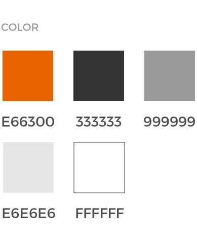
Color
Elder is a special case regarding possibilities for applying color. The safest bet for text is (drumroll..) black text on a white background. Light text on a dark background should be used with caution. Color should be used with caution.
This leaves us with black and white used on most of the elements, and orange and light grey used sparingly. Simple, maybe even bori ng, but easy to understand and readable.
Right, now let’s see how all of that can be applied in real life.
THE RESULT
NOTE: It might not look like much, but keep in mind that every decision here was done for the purpose and for the target audience of the service.
NOTE: This web App was built for usage on a tablet device explicitly (to begin with).
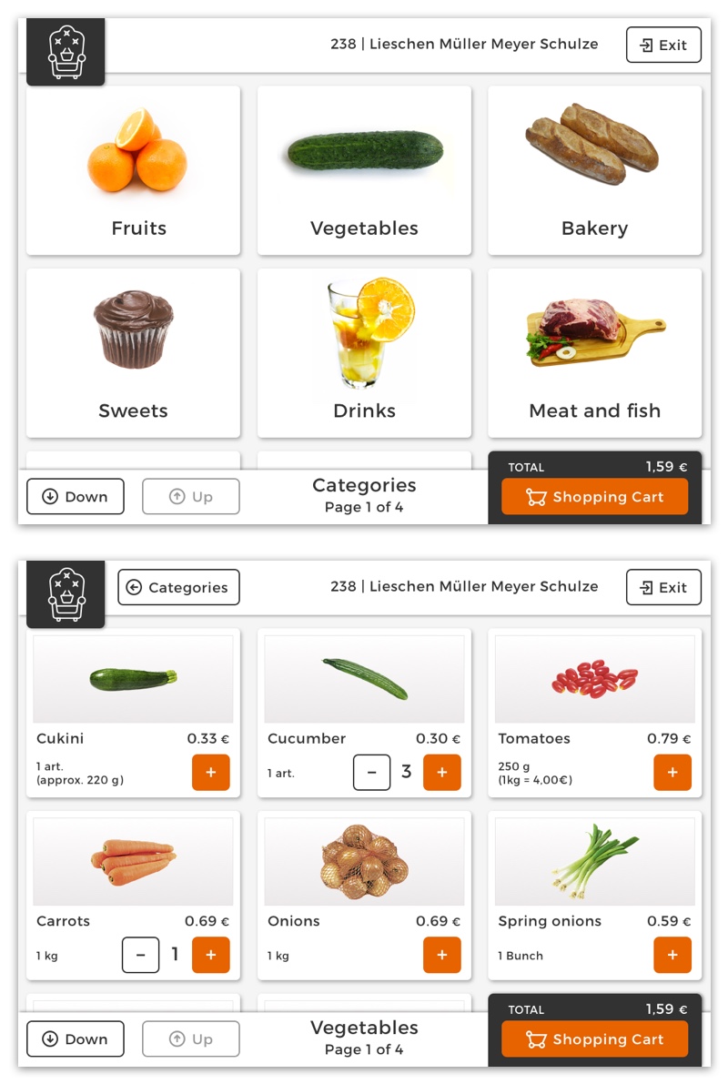
Landing and login
The landing page of Elder - An image of the actual retailer to reinforce that a machine is not replacing the human (stock photo used here). All text is set in black on white and only one action is possible. Type in your room number and you are all set to start shopping.
Note that all text inputs are positioned above the on-screen keyboard.

Product Categories and Item List
Links to logging out and the Cart are available on both the Product Categories and Item List. The total price of the order is displayed as is the current location and amount of pages in this category (bottom center).
Since not all elderly understand the concept of scrollbars or swiping to scroll, I added buttons for moving up or down the lists.
Notice that in none of the screens icons are used as the only means of communicating meaning - they are always accompanied by text. Also, I designed the icons to have thick, solid and geometric strokes so that they would be easy to see.
Shopping cart and Booking overview
The shopping cart includes a list of all the items the user has selected and includes the option to adjust the amount per item. The delivery date is displayed.
Continuing to booking brings an overview of the booking including the amount of items, total price, receiver details, delivery date and time and payment details.
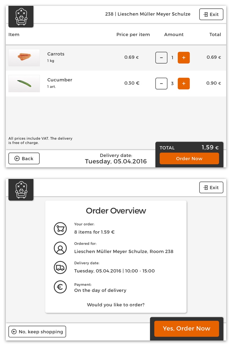
Signup form and Order confirmation
In the case the user is making an order for the first time (detected if a new room number was used to log into Elder), a three step signup formula is started. The form includes the name of the person, the phone number (optional) and extra info (optional). So the minimal amount of information required to use Elder is the room number and name. Nice and easy.

NOTE: In this article I am not covering the part of this system that covers how our client handles the orders and organizes the deliveries because I did not work with that part of this project.
So, that pretty much covers it. It was a small project that was great to work on, the development is long underway and hopefully soon enough both our client and the elderly she serves will be using this system in their everyday lives.
Have a question? Do not hesitate to get in touch with me.

Would you like to read some more?
Have a look at my previous article - Swipes IOS Concept.