EY Walk IOS Concept
Videos of places that matter
UX, UI | Mar 2016

Introduction To The Case
EY Walk is a startup project based in Berlin, Germany. The idea is to create videos of important and special places in the area. In the first version of the app, representatives of various businesses (for example hotels, restaurants, real estate) can order these videos and place a reward for each location to be filmed. The business can then use the video for promotion or other purposes.
Sounds confusing yet? For you to be able to understand what I am talking about, let’s establish a couple of terms:
- Customer - a representative of a business that orders a mission.
- Mission - a list of Walks that the Customer has selected to be filmed by EY Walkers.
- Walk - one of several locations of a Mission. This is the place that needs to be filmed. It can consist of several short videos shot one after another (example - balcony, kitchen, entrance etc.). A walk normally includes a set of instructions to the EY Walker filming the videos (example - introduce yourself, do a 360 turn etc.).
- EY Walker - a person signing up to do a Walk, gets paid for doing it. EY Walkers sign up to do Walks, the Customer reviews the applications and selects one EY Walker to do each Walk.
So the Idea of the whole thing is that there are several business sectors that appreciate a video of a place higher than a series of photos and are willing to pay a certain amount of money to get them.
This article is about the creation of a specific concept that fulfills the business needs of EY Walk and its business partners as well as provides clear incentives for people to become EY Walkers and film videos for the businesses that order them.
Let’s get started!
The UX
First off, let’s define the needs of the two user groups - EY Walkers and Customers.
USER NEEDS
EY Walkers
These people come to the platform to earn money. Since they have spare time to do the videos, they are probably young, very likely students. They also have the means of traveling to the Walk locations.
Customers
These representatives of the businesses very likely have knowledge of and are working with promotion of some sort. They need a tool that enables them to create Missions, add several Walks and control details such as decline, video details, length and financial award amount. For the Customers it is a lot about the big picture, very likely most of their videos have the same details, so they want automation to speed up their work, but have control available if a specific case requires that.
In order to save up on unnecessary expenses, want the ability to assign a Walk to herself or company staff in which case there is no financial reward.
STRUCTURE
This part was a bit complex in terms of planning the interactions. The app has two modes - the EY Walker Mode and the Customer Mode. On top of that there is the Video Recording part of the app that has its own specific requirements. You will see what I mean in a second.
I will need three separate interaction plans to be able to explain the whole thing, so here we go, starting with Graph One - EY Walker Mode.
The relationships of the user states go from outer layers on the left (login + five main navigation items) to more specific to the right. The rhombuses represent decisions important to the current user state. The states with several “boxes” stacked on top of each other means there are multiple of these items.
The first two graphs are similar except for the Missions and To Do processes.
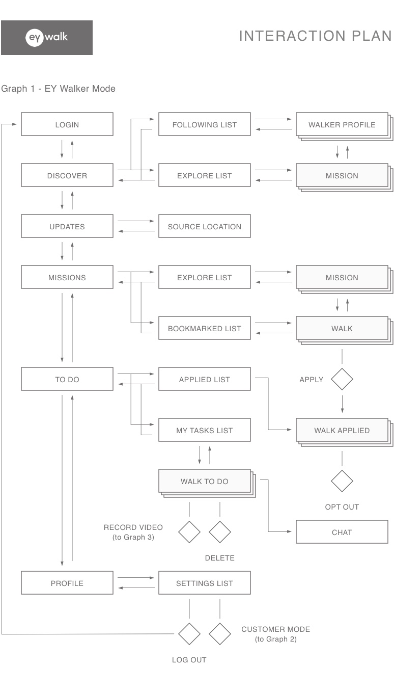
This graph for the Customer Mode includes more possible actions such as assigning staff members, inviting EY Walkers and assigning them.
Customers are not able to Apply for Walks, they can only assign own tasks to themselves. To Apply to walks by other Customers they have to switch to EY Walker Mode (available in settings).

This last graph depicts the Walk recording flow. Each Walk consists of several videos that each has specific requirements. The video can be retaken, played or saved. Once all required videos have been filmed, the user can upload them to be reviewed by the Customer.

Time to make all that logic look somewhat nice.
The UI
Let’s start with laying out some basic design principles and then move on to the user interface following those principles. I will also explain the grid I used to lay out the items on the screens.
THE DESIGN PRINCIPLES
Time to define some rules - the more rules you have before starting to design the screens, the easier it will be.
Typeface choice
For this project I decided to go with Futura Medium by Paul Renner - a geometric, futuristic (pun intended) font that is very popular and known. As the name inclines, it is a modern font (as all geometric fonts are) and has a very good legibility when used in both large and medium sizes.

Typeface hierarchy
For sizing I only used three variations - heading one for titles, body text of, well, body text and caption text for buttons and all sorts of supporting text. Since a mobile screen is limiting the variations of sizes that can be used comfortably on a mobile screen, I in stead used other methods of showing meaning of the text like color (red or light grey) and capitalization (UPPER CASE or Normal case).

Colors
As is a good practice when creating clean user interfaces, I only used the red of the existing identity, three grays of various darkness and white. Less is more.

THE GRID
In this article I also want to let you in on a little secret that most designers use when creating user interfaces. It is called a grid.
A grid is an underlying system or organizing elements of a design that helps creating a unified rhythm.
This means that when the rules of the specific design have been created, the grid is then used to set the sizes and positions of pictures, buttons and the baselines of text. It is not always visible in the resulting design but it always creates a sense of organization and alignment.
Have a look at the picture below. These are two cutouts of the same area of the EY Walk design - with and without the grid. If here is a thought-trough typographic system in place, the design seldom requires deviations from the grid to feel just right.
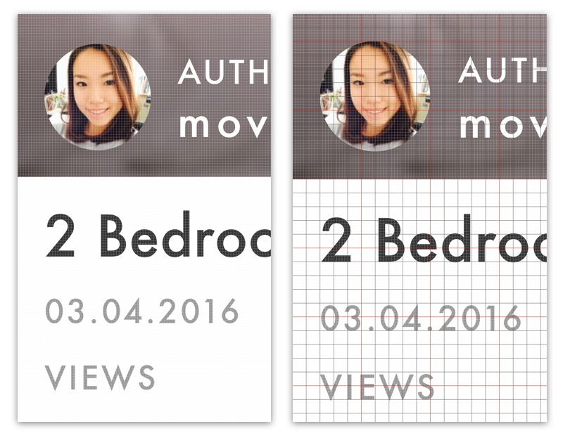
For this design I used a 15 pixel grid. The natural iPhone 6 screen size (not accounting for the Retina display) is 375x667 pixels. I simply took the horizontal width of 375 pixels and divided it until I reached 15 pixels. This gives me exactly 25 reference points for alignment and sizing horizontally (and many more vertically).
NOTE: Just to make it clear, the grid is not a new design approach - the Swiss Style has been around since the 1920’s. It is a constraint that the designer puts on herself to better organize the content being designed. It simply provides a rhythm and a balance to the design.
Ok, now that you know what is under the hood, have a look at the result.
THE RESULT
NOTE: This is only a look at couple of selected screens - this is not the actual end result of my work.
Loading and Discover
Here is the loading screen giving the user an expectation of the fresh service coming up in a moment. The discover screen includes a feed of the videos created on the EY Walk platform. The bottom navigation indicates the current location.
Note that all text inputs are positioned above the on-screen keyboard.

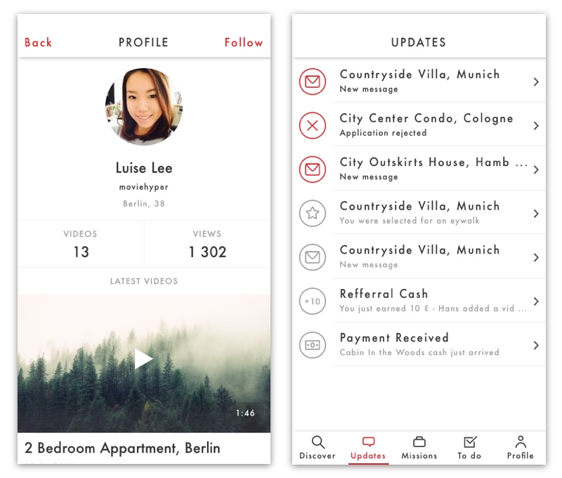
User profile and Updates
The user profile includes the picture, name, username, city and location of the EY Walker. Below a list of the latest videos of the user is available.
There are several types of standard updates that the users can receive such as being confirmed for a Walk, receiving payment, getting a new message etc.
Missions
The Mission list includes all of the Missions with public Walks that have not been assigned to any Walkers yet.
In the single Mission view the user sees an overview of all of the Walks of the Mission in a map view (dummy map here). The Walks are then listed down with prices and “assigned” indicators depending on the status of the walk.

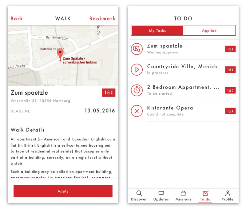
Walk and To Do
A Walk detail view includes a location of the walk in a map view (dummy used here) with the main information such as the title, price, address, deadline and a description. The main action to be taken in this screen is Applying for the Walk.
If the EY Walker gets approved for a Walk, it will appear on their To Do list. Each Walk has an icon indicating the current state of the walk - to be started, in progress, waiting approval etc.
Filming list and Camera
Since each walk consists of several short videos, there needs to be a way of tracking progress and seeing which videos still need to be done. One all mandatory videos are done, the material can be sent to the Customer.
The Camera view has a timeline indicating the minimum and maximum video length. The options to exit the camera view and flip the camera are included. The main action is starting filming.

Camera during filming and done
The EY Walkers see the timeline filling in as they film he video. Once filming is done, the user can either save, retake or play the video she has just taken.

Video Upload
Once the walk is done, it has to be uploaded for the Customer to review them. Since there are potentially large file uploads, the users have to be able to see the file sizes and be able to pause the upload to finish it once they are connected to wi-fi.

And on that it is time to finish this article.
If you have any feedback, suggestions or questions - reach out to me.

Feel like reading more?
Have a look at my previous article - Elder Web.